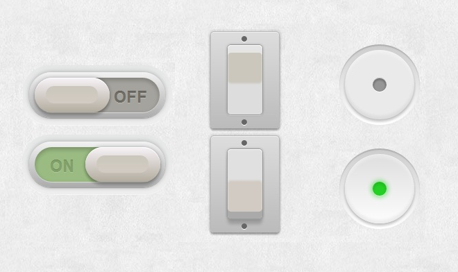
纯CSS3实现超炫酷的3D开关切换按钮
- 作者: 黑歌作者
- 来源: 51数据库
- 2020-08-10
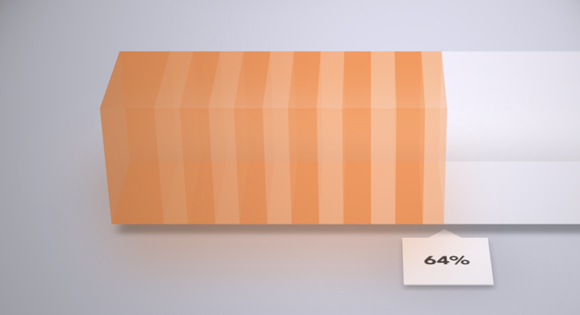
这是一款用纯CSS3实现的开关切换按钮,按钮一共有四组样式,每一组按钮都有3D的视觉效果。和普通按钮不同的是,它们都有着开关切换的用途,也就是说点击按钮可以在两个不同的状态下进行切换,效果非常棒。实现原理也是比较简单的,主要利用CSS3重写checkbox的样式,3D的效果也是CSS3实现的。

在线演示源码下载
这里我们对第二种样式进行简单的代码说明。
HTML代码
<section class="main">

	<div class="switch demo2">
		<input type="checkbox">
		<label></label>
	</div>

	<div class="switch demo2">
		<input type="checkbox" checked>
		<label></label>
	</div>

</section>
CSS代码:
.switch.demo2 {
  width: 50px;
  height: 100px;
}

.switch.demo2 label {
  background: #cbc7bc;
  margin: 0 auto;
  border-radius: 5px;
  box-shadow:
      inset 0 1px 0 white,
      0 0 0 1px #999,
      0 0 5px 1px rgba(0,0,0,0.2),
      0 2px 0 rgba(255,255,255,0.6),
      inset 0 10px 1px #e5e5e5,
      inset 0 11px 0 rgba(255,255,255,0.5),
      inset 0 -45px 3px #ddd;
}

.switch.demo2 label:after {
  content: "";
  position: absolute;
  top: -20px;
  left: -25px;
  bottom: -20px;
  right: -25px;
  background: #ccc;
  background: -moz-linear-gradient(#ddd, #bbb);
  background: -ms-linear-gradient(#ddd, #bbb);
  background: -o-linear-gradient(#ddd, #bbb);
  background: -webkit-gradient(linear, 0 0, 0 100%, from(#ddd), to(#bbb));
  background: -webkit-linear-gradient(#ddd, #bbb);
  background: linear-gradient(#ddd, #bbb);
  z-index: -1;
  border-radius: 5px;
  border: 1px solid #bbb;
  box-shadow:
      0 0 5px 1px rgba(0,0,0,0.15),
      0 3px 3px rgba(0,0,0,0.3),
      inset 0 1px 0 rgba(255,255,255,0.5);
}

.switch.demo2 label:before {
  content: "";
  position: absolute;
  width: 8px;
  height: 8px;
  background: #666;
  top: -13px;
  left: 20px;
  border-radius: 50%;
  box-shadow:
      0 120px 0 #666,
      0 1px 0 white,
      0 121px 0 white;
}

.switch.demo2 input:checked ~ label {
  background: #d2cbc3;
  box-shadow:
      inset 0 1px 0 white,
      0 0 0 1px #999,
      0 0 5px 1px rgba(0,0,0,0.2),
      inset 0 -10px 0 #aaa,
      0 2px 0 rgba(255,255,255,0.1),
      inset 0 45px 3px #e0e0E0,
      0 8px 6px rgba(0,0,0,0.18);
}
在线演示源码下载
推荐阅读